Strategic Engagement
Crawford was looking for a new, cleaner look and feel that would allow strong positioning for current and potential clients. Efforts included logo update, color palette refinement, sales books, promotional materials, client & employee engagement pieces, and more.

We used the established icon and turned it on it’s side.
This simple change created an interaction that mimics the cohesion the organization achieves within itself and among clients. This “C” and “S” within the icon also visually reference infinity and idea of creating new and more. A handsome typeface was paired with the icon because of its clean edges and functional tribute to the spirit of craftsmanship.

A series of sales books were designed to highlight Crawford Strategy's unique position in the market in a colorful and interesting way.
Efforts included page layout, iconography to drive the reader through, development of icons for various areas of influence and steps in process, and outlining in a user-friendly manner various aspects of marketing.


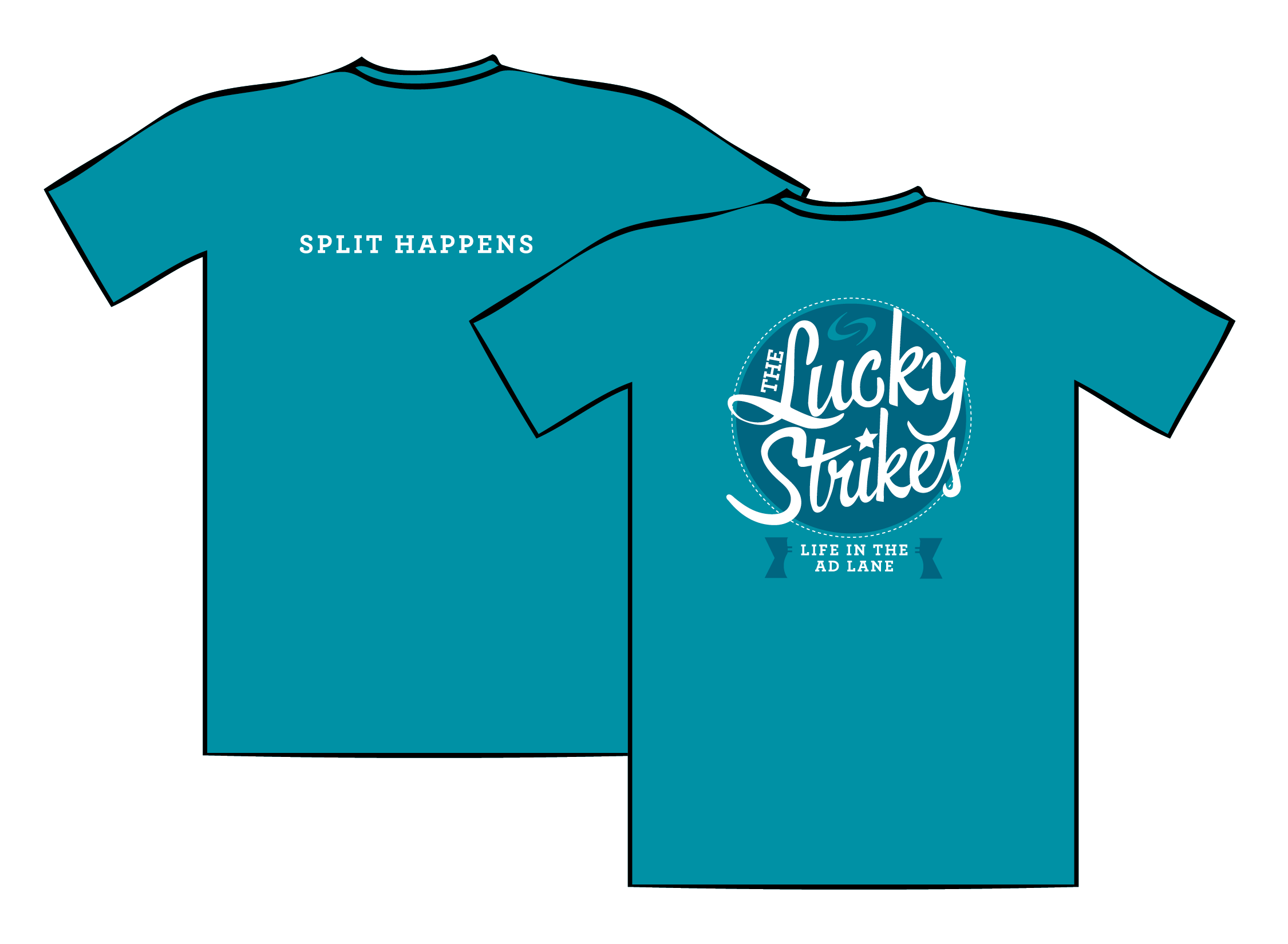
Vintage inspired playful shirts add excitement to a surprise event.
As part of a team retreat, shirts were designed for a surprise bowling tournament. Playful team names and taglines were developed to add an extra level of fun and interest to the event.


As part of the team retreat, playful awards were created to recognize various skills of the day.
Designed to reflect the recently updated brand, these colorful designs made the competition a little more fun.
ROLES:
Art Direction & Design
Illustration, Design, and Copy Development with Copywriter
